COMPASS
Narrowing home search
Agents' search options could be complicated and they don’t always find the right listing for their clients quickly. Advanced selection is like a "shopping cart" experience that easy for agents to see what listings they have selected. The feature has been launched for a while and the usage rate is lower than expected. We would like to know why, and how to improve the experience that can help agents to narrow their home search.
Role
UX designer
Category
Web
Timeline
1.5 month
My Role
Collaborated with 1 product manager, 1 user researcher and 1 designer from design system to identify problems, plan and execute solution.
Define the problems
From provided data and testing session recordings
Design Solution
Wires, Prototyping, User testings, UI Design.
Current State
- Advanced Selection was released to users.
- Usage numbers are lower than expected.
- Product team are interested in understanding why.
- Also interested in understanding how to improve this feature.
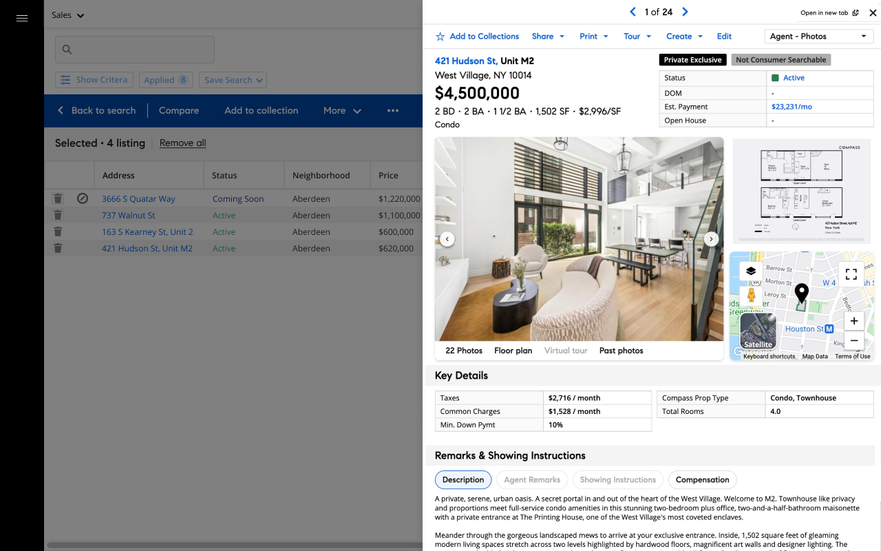
Primary use case
The primary use case is to allow agents to select listings from their search result and build a group of listings they are interested in to take action on later.
Advanced selection current design
Problem 1
The feature is hidden - Users could not find it when they needed it.
Evidence
From the interview, 4/6 agents could not find the feature after hearing the task.
Solution
We need to it stand out and close to relative features.
Problem 2
The current feature is not solving their problem or not being helpful for their existing workflow.
Evidence (Quotes from agents)
“The only thing if I had a couple of selected here, that I want to see pop out is kind of like how we get a side view (Listing details) over here”
“Just seeing this (advanced selection
dropdown) does not give me a lot of info…”
Solution
Allow agents to narrow their search results.
Where we landed
Design Process
See the details of how we get here
Finding insights
By reviewing the testing session recordings, LFR (Learn from reality) study, and data from Fullstory, I found out:
Users would like an easy way to focus on what they have selected so they can narrow their choices by looking at listing details for each chosen listing.
Questions must be answered: Should we clear users' selection after changing their filters? — Conflict feedback came from agents.
From interview:
A: "For XYZ client, I would start a more general search. I would select a couple of single-family properties; then I would like to change my criteria, add a few more condo listings, and send them to the client…"
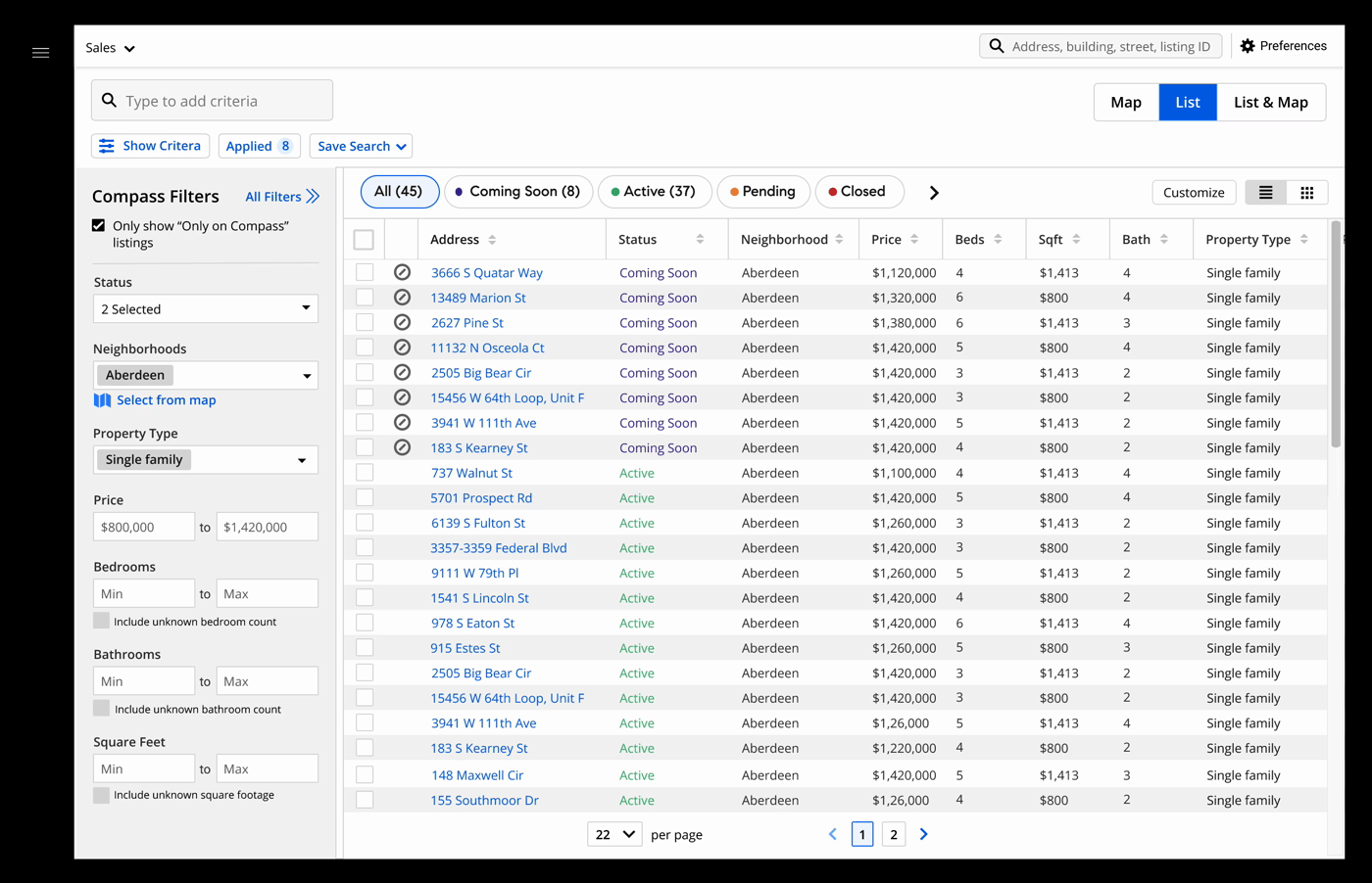
B: "if I change my filters - starting a new search - I don't want the selection there anymore."Few MLS heavy use agents keep referring to the Refine experience in MLS vendor’s product while they are testing advanced selection.
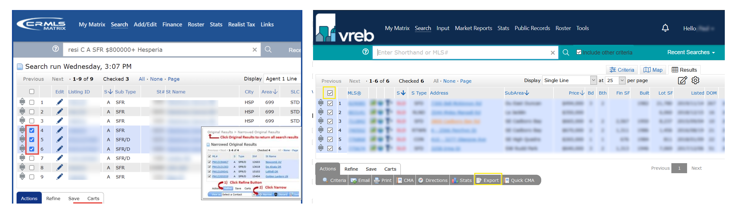
Other MLS products (LFR) Refine feature
Ideation
Idea1
Added a “View selected only“button just beside all the commonly used actions. When the user clicked on the button it will hide all the unselected listings.
Challenge
It is not clear to users that they are building a list of selections. They would not be able to see the listings updates if they change their filter selections.
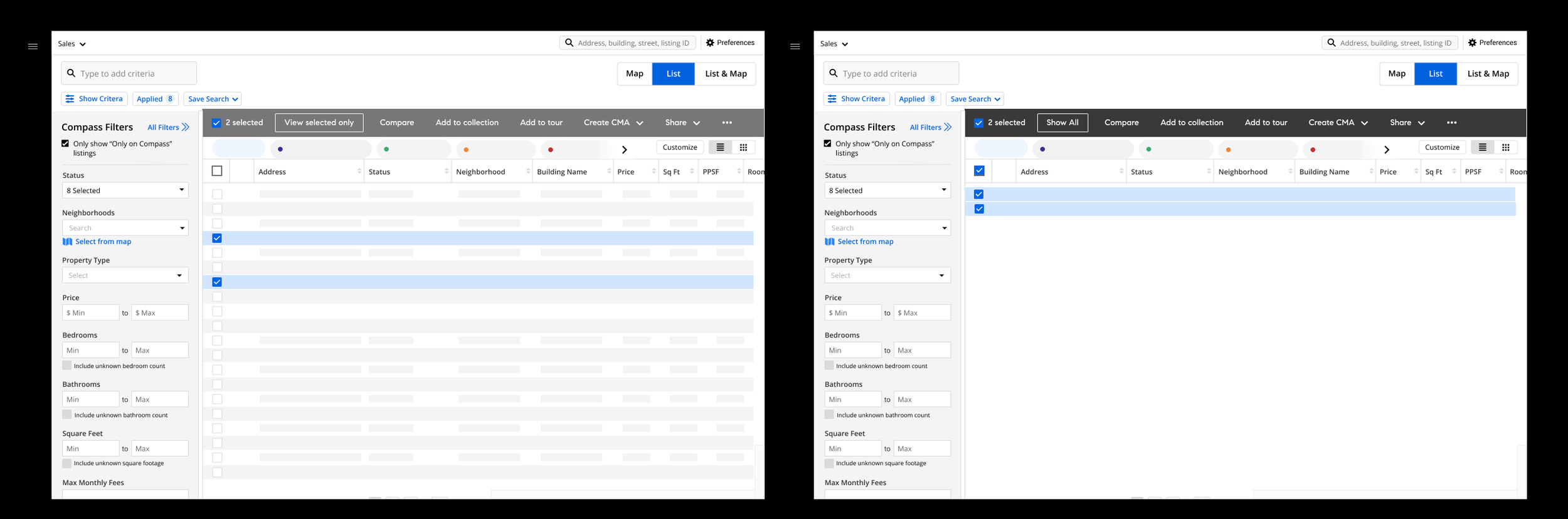
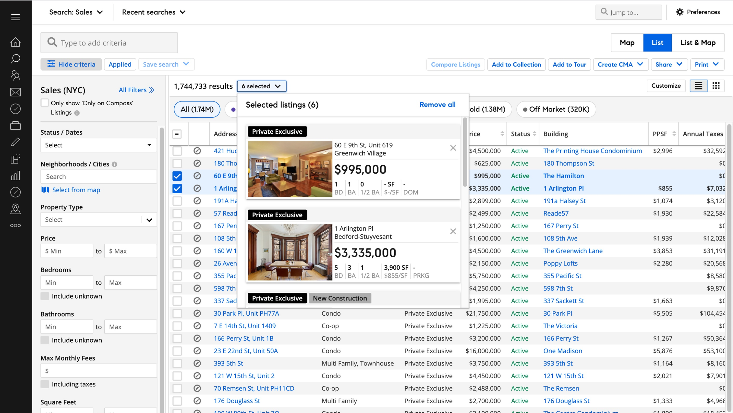
Idea 2
Introduce a new action bar style - slide from the bottom of the page. When users clicked on the selected button, it will bring them to a full-screen modal where they can only see their selected listings.
Challenge
Design system designer feedback : We need to use the design system bulk selection component

DS bulk action component
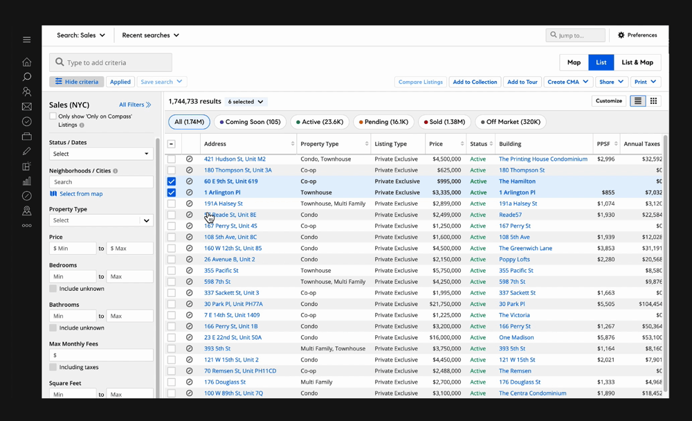
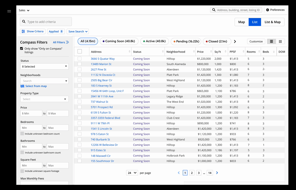
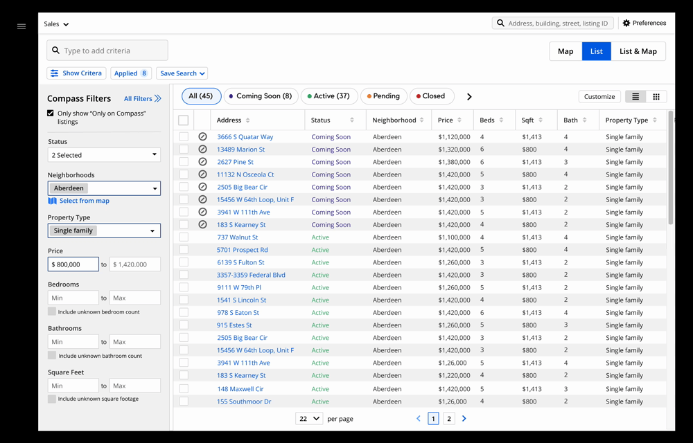
Final solution
Based on the feedback from the team, I came up with the 3rd idea which we all liked, and decided to move forward on testing this one.
I used the bulk action bar component from the Design system and added a selected button on the bar. When agents clicked on that button, it will extend the bar meanwhile hiding the filter panel and unselected listings on the page. It provided a focused state for agents to just focus on their selected listing while keeping all other features that would help them to narrow down their choices.
Feedback from testing
We A lot of positive feedback
“Glad this is going in this direction”
“A lot easier, you can focus on the ones you want to”
A new problem: A few agents were confused about the repeated actions on the page.

Solution
Collapse actions on action bar with use clicked on the listing address
Show a blocker when user mouse over to the listing side