Condos.ca
Perfecting the Search
Condos.ca is an industry leading real estate website that offers a large amount of condominium buying and selling data to 5 Million registered users in Canada. The search experience became slow and complex because of a slew of disparate features.
I was part of this crucial project of the company to improve the experience to be simpler and more seamless for both new and existing users, as well as to collect meaningful data to define users’ objectives and situations so that we could provide customized service in the future.
Role
Lead and Solo Designer
Category
Web
Timeframe
6 month
The Challenge
Based on our data, we found that users who became our client at the end liked to use the search feature more compared to the rest. Through our user research and data collected from screen monitoring application, we found that our search page had many UX problems. We considered this to be an important factor that affected the business.

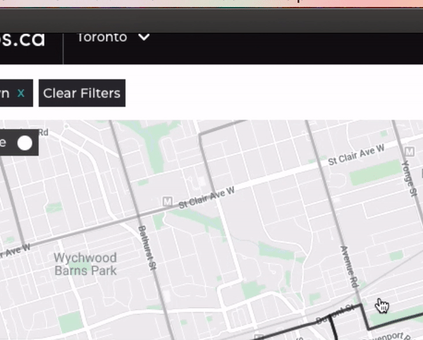
Old condos.ca search page
Our Goals
Our business goal is to increase User Stickiness (retention + engagement = stickiness).
How to achieve that goal on the Map / search page design?
Make the search fast and easy-to-use for all home buyers and sellers.
Create a platform for deeper engagement and make it “sticky”.
Improve the conversion of “information” to better “intelligence”.
My Role
I am the sole designer of the search experience redesign of Condos.ca. I collaborated with the Product Owner, Product Manager, a Product Marketing Team and a Development Team to research, scope, identify goals, plan and execute. The product launched in March 2020.
Responsibilities Included
User research: User behavior data analytics (what is happening on web), 1-1 user interviews (why it's happening).
Define goals and prioritize problems: User groups, Persona, Journey mapping pain points and user tasks, Competitor research
Communication: Aligning key stakeholders on product goals and scope planning.
Solution: Wireframes, Prototyping, User testings, UI Design.
Initial Discovery
Based on our early research, we found that users encountered several challenges when using our search page.

Confusing Direct Search Forms
Users cannot distinguish the difference between multiple search forms on the map.
Users spent a long time to find the right search forms.
Users did not know how to utilize different search forms for locations, areas and cities.
Busy Filter Display
The search form could get very overwhelmed as the space also got occupied by selected filters.
When it got busy, it was hard to find both location input and filter selections.
Inconsistent Area Select Path
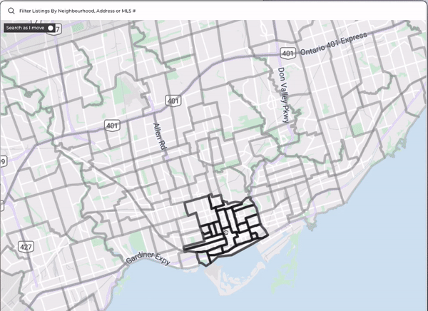
Selection on map was not easily recognizable.
Users were prone to make mistakes when they clicked around the map.
Inconsistent experience on area selection.
Deeper Insights
Why did our map need to be that complex?
One of our goals was to help users to understand their potential neighborhood and not just the home and what’s inside. Thus we had neighborhood selections on the map and we should focus on improve the experience of it.
Improve search experience for first time users
One of the findings was existing users, once they passed their learning curve, had decent experience using the product but it was generally hard for first time users. Thus we focused our design to make it simple to use especially for first time users and used the Register Rate as metric to define success.
Define Success
We combined the quantitative data and usability testing qualitative data to find and prioritize problems, and also define success.
We would like to test with the same users to see if the issues were resolved. As the market was changing over time, we wanted to compare the data with the relative time period.
Session duration
Page views
Page session
Map Bounce rate
Search bar clicks
Save alert clicks
Back button clicks
Homepage page views
KPIs
Case Closing Rate
Register Rate
User retention (DAU/WAU/MAU)
Final Design
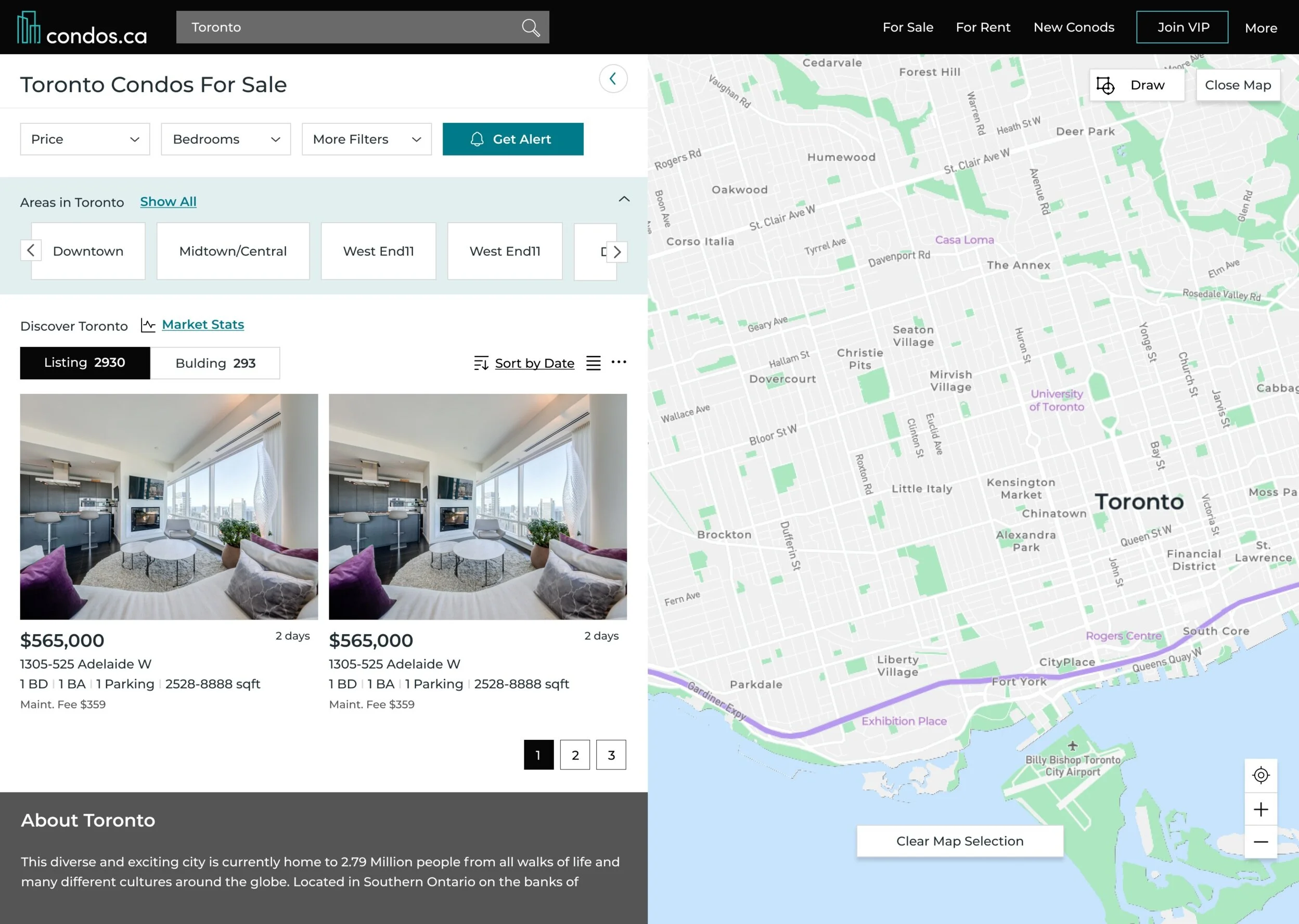
Final Search Result Screen
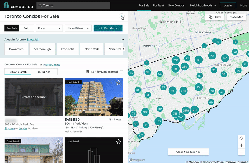
Map view


After we launched the first phase, we saw a 31% increase of DAU, 25% increase of MAU and signup rates was about 12% up.
We had more page views and less bouncing rate on our search page, which encouraged us to keep optimizing the design/content of it.
Design Process
User research
Extract and summarize data
In the early research, we were focusing on defining who our users were. We categorized them by their ages, their home buying experience, and even their purchase goals. This gave us a pretty holistic view of our users. However I did not find any significant search behavior differences from those user groups. During the user interviews later on, I found that users searched for things differently when they were in different purchase journey stages.
For example, users who were in the early stage of purchasing a property - they would often use less than 2 filters, as the goal of their search was to get to know the market. On the other hand, for users who were ready to purchase - they would often use a few more filters and focus on searching at some specific areas or buildings.
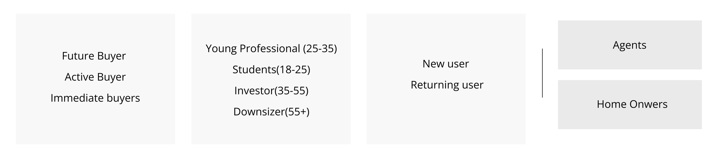
Find pattern and create user groups
In addition to user age and new/return status, I started to label our users based on the stage of their journey such as fuzzy search buyers, future buyers, active buyers and immediate buyers. Active buyers and immediate buyers had the highest business value - they were more likely to require a professional agent’s services. At the end, I grouped fuzzy search users into future buyers as a single group.
After that, our users could be any combination of these three columns in the form below.
Persona and User Journey
Combining the data from our agent deals, user survey and Google Analytics, I created 4 personas shown below. Based on that, I built user journeys to find what their needs and behaviors are, by using our product on different devices.

Create Insights
Knowledge drives users to the next journey stage
Users’ searching process was a process of defining what they wanted. If we could provide some useful information that could help them to make purchase decisions and possibly progress in the four journey stage below, they would most likely come back and use our product again. We called this “sticky content”.
In our user research I found the more knowledgeable the users felt they were, the closer they were to make a purchase as plotted below.

From analyzing our persona and user journey, we thought “knowledge” could be broken down into:
How to buy a property?
What is the market trend for this area?
What is my affordability?
….
For search specifically, according to my research, users gained the best knowledge from the location of the house. They wanted to know what this location had, how was the lifestyle there etc.. We needed to design a clear map that was easy for users to use and seamlessly introduce the neighborhood information.
How we got there
-
(The following data have been modified for privacy purposes)
- 60% user selected multiple neighborhoods and areas in their alert
.- 72% of users who applied filters on their search page
- they only used the filter “price” and “beds”.
- Mobile bouncing rate is 43% higher than desktop and it is mostly on map/search page.
- Mobile users used the listing view more than the map.
- The top three initial searches were areas in Toronto which occupy 55% of the total searches..
To define issues, I combined user tests with data analytics. For example, when I saw some issues in the numbers quantitatively, I would do some user tests or check the screen monitor application to obtain more detail. Also for example when I saw some issues users made during the test, I would check related data to quantify how big the issues were.
-
We did 9 user interviews to test our current search page. 3 of them were new users who never used our website before. 6 of them were old users that had been using it for a while. In terms of journey stage, 4 future buyers, 3 active buyers, 1 immediate buyer and 1 homeowner. We also tested on both desktop and mobile.
We listed all the issues from user interviews and ranked them in our list. These were the top 7.- User could not search any residential address- Loading speed was slow- New users were very confused of where to search- Users confused about how to select a neighborhood- Some users could not find neighborhood stats which they found very helpful- Some users could not see the neighborhood names- Some users wanted the maps to be bigger. Around half of them liked the list view and while other half liked map view
Meeting Our Design Challenges
How to optimize and simplify our search?
How to educate users about neighborhoods without blocking their search?
How to determine the best layout?
How to design for different user preference?
How to keep it mobile friendly?
1. Simplify Search Form
Create a universal search that can search everything
Given the fact that the multiple search forms were so confusing to users, I communicated the idea and drove the development across multiple teams to create a universal search form which displayed predefined categories. In addition to that, I relocated the filter selection out of the search bar. In the end, this new universal search bar could search everything easily and ended up to be a huge success.
Before
After
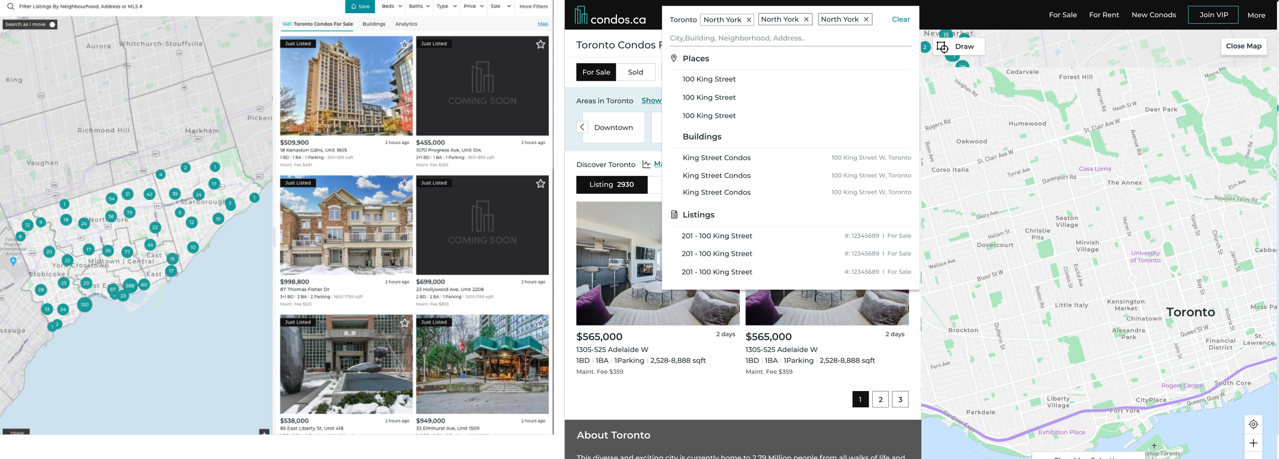
New Design
- Only one universal search bar
- Display selected filters separately
2. Provide better Education Through Search Result
Know neighborhood in a more intuitive way
Our data revealed that:
58% of the respondents preferred having listing panel on the left and map on the right.
72% of users who applied filters on their search page - they only used the filter “price” and “beds”.
60% user selected multiple neighborhoods and areas in their alert.
Based on these insights, I swapped the position of the listing panel and map, and placed filters at the top of the listing panel. This was more consistent with the common search process: first, select the areas they are interested in; second, apply filters and at last, browse the result.
After a few tests with this initial design and along with the feedback from the stakeholders, I discovered the following issues.
Wireframe 1.0

Wireframe 1.0 problems
1. Neighborhood selection button was hard to find and hard to place when there are too many listings on the map.
2. The listings/buildings selection tab was not easy to find.
3. The area stats information was missing.
4. Selecting multiple areas on map was not easy.
5. New requirements - we had to keep our breadcrumb on the search page for SEO.
After a few variations of design, we tested wireframe 2.2 on usertest.com with 8 users, we got a lot of positive feedback.
Wireframe 2.2
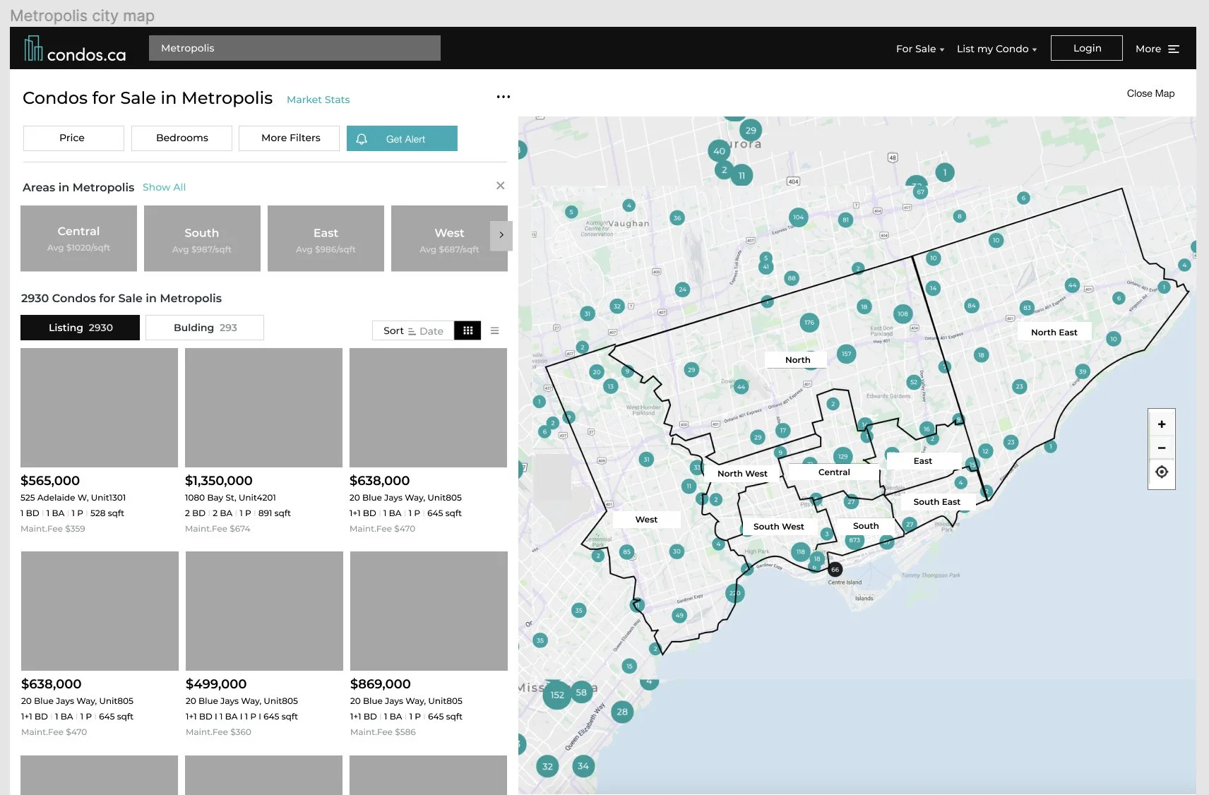
Click image to see the prototype
3. Determine the best layout with data
Let users tell us the preference
Through interviews, I got different feedback from users - some of them wanted to have the map be bigger, and some of them loved the way it was. We had limited resources to collect more convincing data at that time, so I decided to leave the default stage half and half, and give the users the choice to either extend or close the map. This way we could start to collect data and monitor their preference quantitatively.
After around three month collecting the data, the button that minimize/extend the listing panel got surprisingly high usage rate at around 75%. This drove us to further adjust the panel size vs. map size over time.

Click the image to see the website
4. Tailor to different users’ preferences
Provide the right product to the right users
From the user research we found out one of the top criteria of finding a dream home to live is location. I proposed to provide some special filters that related to location to fine tune the selection such as ”near park” and “close to transit”.
By having that data, we can do a better job on our recommendations. We believe if we can collect related information, we could definitely improve our service and increase our user stickiness.

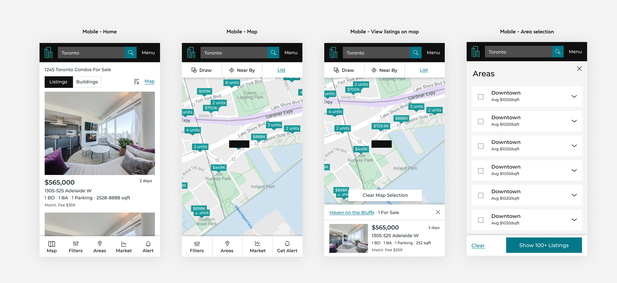
5. Mobile friendly design
Be not just “responsive” but more “mobile friendly”
While I was designing the map/search page, we didn’t have a mobile app. Mobile web was our only option for mobile users. As our mobile users were rapidly growing, for the mobile web design we wanted to target “mobile friendly” instead of just ”making it work” such as adding a bottom navigation bar with five most commonly used actions.