Condos.ca
Building and Listing Pages
Building and listing pages were the most important pages for Condos.ca which had the most of our landing traffic (benefits from our SEO). Building page provided building specific information, such as number of active listings, sales/rent history of the building, and construction details. Listing pages provided property specific information, such as property description, property photos, and price history. Through the two pages, we wanted to build a strong relationship with user so that at the end they would adopt our agent services.
Role
Lead and Solo Ux Designer
Category
Web
Timeline
3 month
The Challenge
Based on my user research, I found user really like some of our content/feature (e.g past listings information) but they did not know we had them initially. From data, we can see there was not a lot user event for those features, we also do not have a good way to track the usage of those features. The bounce rate of these two pages is very high and we want to improve that. My goal is to improve the usability of these two pages, build a stronger connection with users that make them to use our product as their primary real estate research tool.

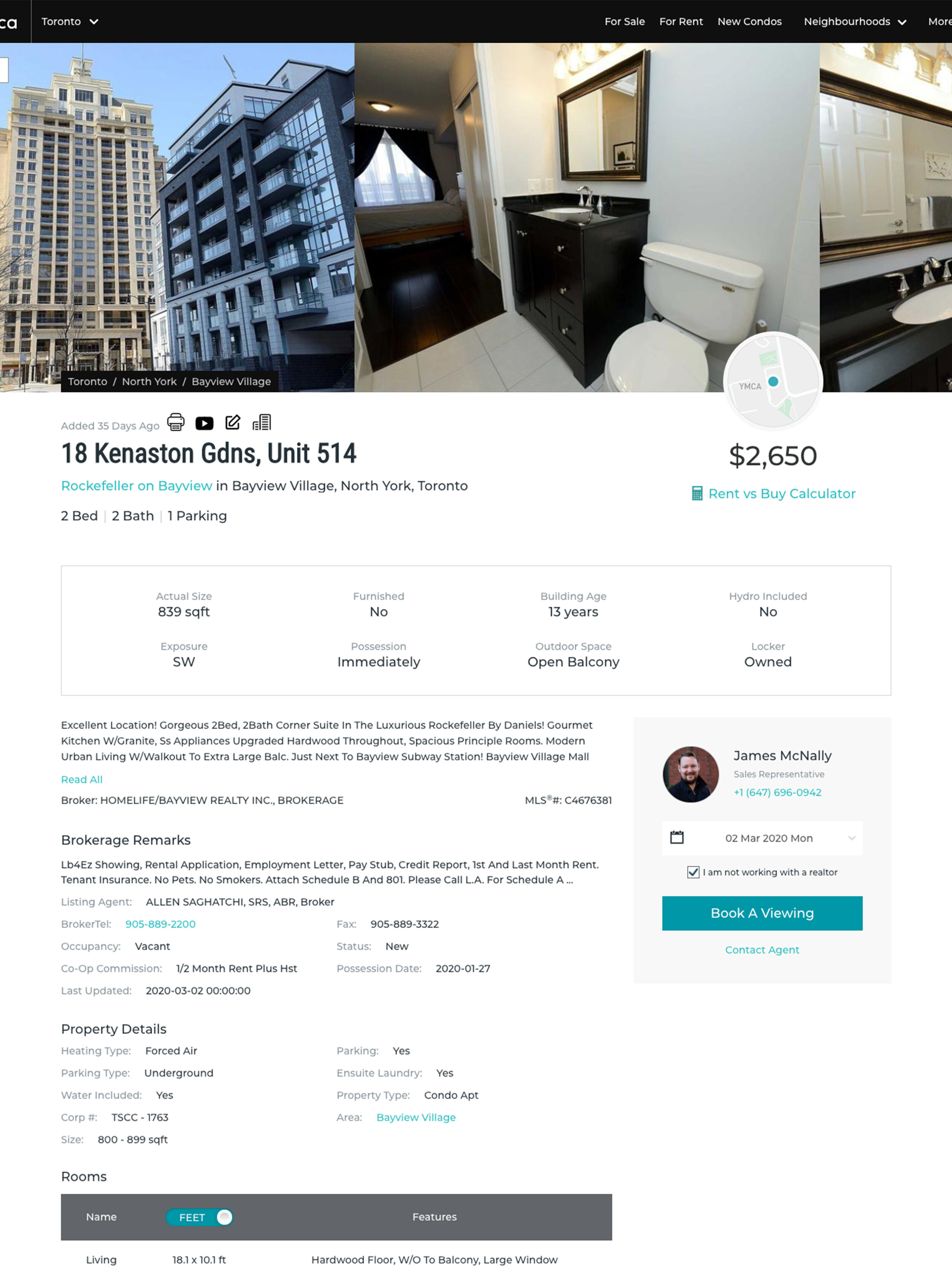
Old condos.ca building page
Our Goals
Our hight level business goal is to increase User Stickiness ( Retention + engagement = stickiness ).
How to achieve that goal on the listing and building page design?
1. Make the page more intuitive, easy to find information.
2. Help user to expand their search, provide alternative options.
3. Provide valuable content that help user to find if this is what they want, build trust with them, increase proactive contacts.
4. Make it more mobile friendly.
5. Take into account the Web Content Accessibility Guidelines (WCAG 2.1).
These were not our initial objectives. It has been updated with ongoing user and product research. I will cover the process of identifying design goals in design process.
My Role
I led the product design of the Building and Listing page redesign of Condos.ca until the present day.
Team:
VP of product, tech lead, product manager, graphic designer
Activities:
Responsible for Redesign, Discovery and User Research, New feature ideation, Information Architecture, Prototype
Define problems
For redesign a page the first thing I would like to do is finding out what are the current issues of the pages. I did about 2 runs of user testing session. Gathered with feedback from agents, stakeholders and some data. I ranked the usability issues for Building and listing page based on Frequency, Impact and Persistence
The top problems are:
Valuable content/feature was not easily noticeable
Users could not easily find
relative information on building page
past sales information
listings in the same building (on listing page)
building location, and nearby amenities
Lack of connections between pages
No clear way to start a search
No clear way to go to building page from listing page
Page readability was bad
Some building information were on the top left panel, some were located in detail section
Pages content details were hard to scan
Inconsistent design style
No consistency in design style on search page and building/listing page.
Deeper Insight
Bounce rate
We found bounce rate was high for listing and building page, but the page time was okay. Seems like user just came for the information and then leave the page. It was understandable for users who came to just find the information they want. But how could we engage them more? Anything else we could do to build more trust with use?
Design for different user groups
Same as the map/search page project, We wanted to be able to know who were the users that were ready to buy, what journey points they were at? we wanted to be able to provide customized service/help for them.
Find potential opportunities
We have had a lot of traffic from google organic search since the last SEO updates. We have big potential to keep our users if we can know them better and provide better content.
We prioritized a few key features that would be most valuable and feasible, that would make the page more sticky. We believe we will become more successful by adding Comparable Listing and Affordability Calculator. They will help users to know what is right, and give us more data so that we can know our user better.
Measure Success
KPIs
Register Rate
User Retention (DAU/WAU/MAU)
Number of Mobile users
Session duration
Building & listing pages page views
Bounce rate
Map and search page clicks
Save building alert clicks
Back button clicks
Key features clicks
Key Changes in Design


End result
After launching the redesign, we achieved 20% increase in page view, 15% reduction in bouncing rate, 29% increase in DAU, 22% increase in MAU and ~15% increase in sign-up rate.
Design Process
User Research
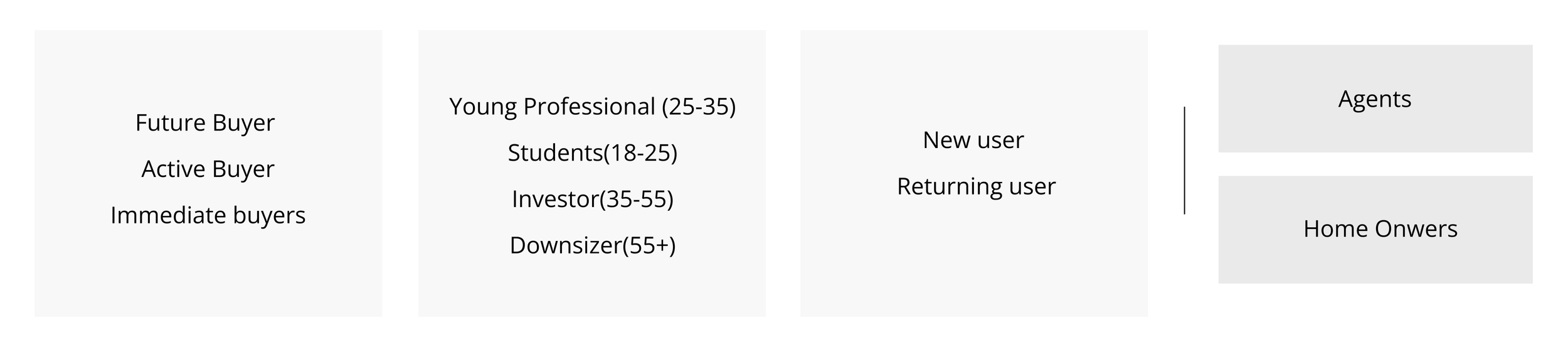
Similar to search experience, I labeled our users based on the stage of their journey such as fuzzy search buyers, future buyers, active buyers and immediate buyers. Active buyers and immediate buyers had the highest business value - they were more likely to require a professional agent’s services. At the end, I grouped fuzzy search users into future buyers as a single group.
After that, our users could be any combination of these three columns in the form below.
1. Understand different goals for users at different stage of their journey

While I am doing my research, I was also curious to know, for users at different journey points - are they looking for different content?
Different content preference based on different journey point.

From the research we can see, users who are at Fuzzy Search, Educated Intent, and Buying process stage may have more web activities compare with users at other journey stage. This is helpful for us to define target clients and approach to the leads at the right time.
2. Find key factors that influence user decisions
I conducted a user survey where 3000 users replied. From the survey, we ranked what were the key information that affected user decision the most.

3. Improve content structure through card sorting
The first content strategy I decided to use is card sorting. I ran 3 card sorting sessions with our users (included 25-35 future and active buyers), and my goal was to learn what users knew, what they thought they knew, and how they prioritized information on current building and listing page.
Journey-mapping pain points
Pain points became crucial moments in a user's choice of action. They could affect users negatively. Users might get frustrated and leave our website.
Based on data, there’s two major entrance for user traffic landing. 85% of users first landed on our building pages as they searched building address or name from google. They got to know our product from there. The other way was from direct search. Users landed on our homepage and started their journey from there.
Most of the users who had the first touch point at building or listing page were new users, the other ones were mostly returning users. By utilizing the persona, I created two key user journeys for our product. And from these two journeys, I found 2 major pain points that might have a connection with our bounce rate.
1. If user landed on a building page, it was not easy and intuitive for them to find a way to start a search

2. On listing page, user could not find other listings in the same building

Design Solutions
1. Provide better readability by improving content structure
Prioritized the content based on the key factors list (user survey), user interview feedback and the card sorting result.
Put relevant information together and added more data visualization for building/listing stats so the key information was easy for users to find and understand.
Divided content based on content legibility so one group for those had better legibility in short width and the other one had better legibility in wider width.
Applied 2 column design for short width content so the left column became bigger with key information, and our call action content was sticky on the right column.
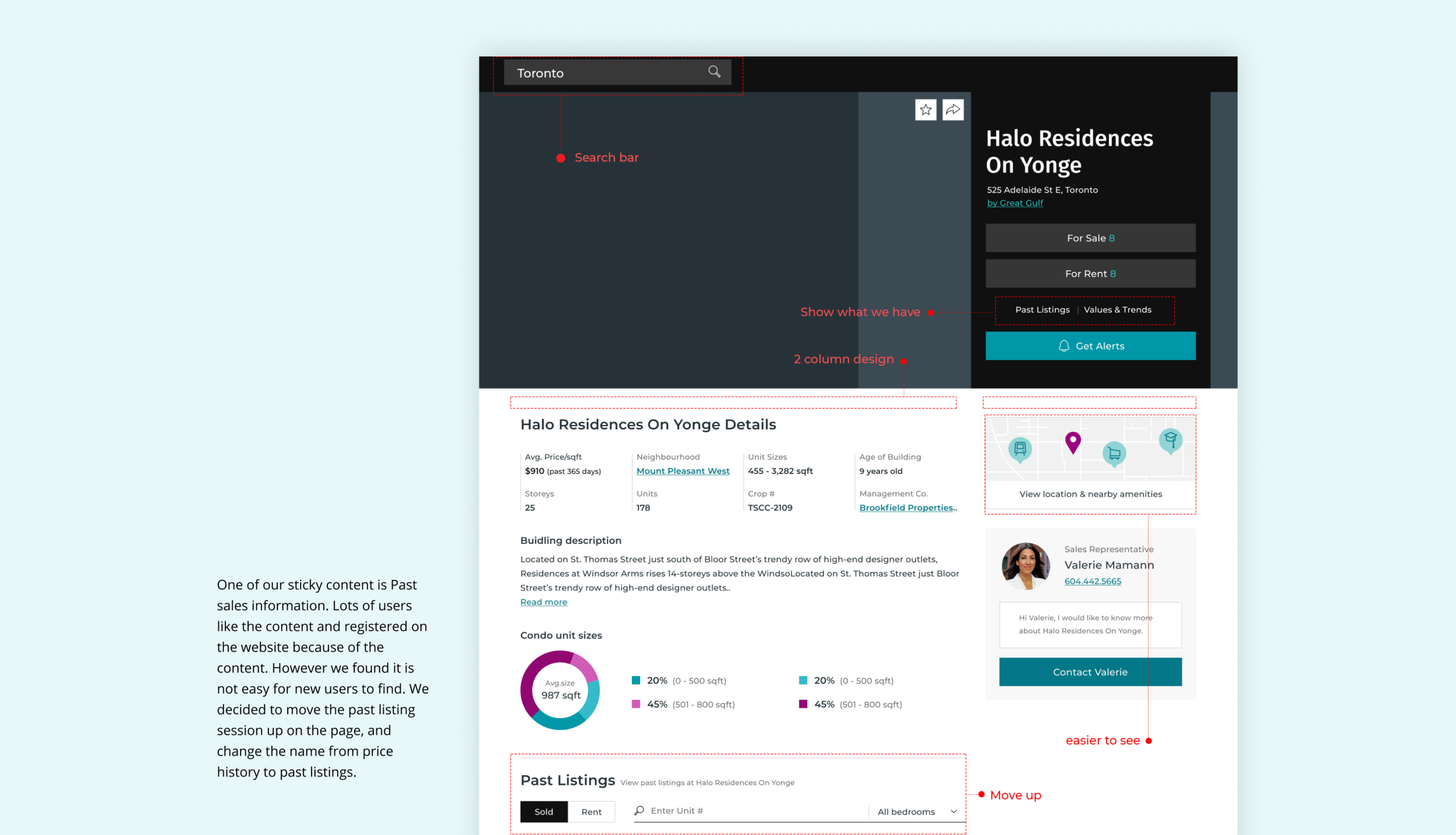
Click the image to see the design of Building page
2. Improve user flow by expanding search easier
As a lot of users were starting their journey on our product page which was our building and listing page, it was important to provide alternative choices when they did not find what they want.
Two solutions for the pain points:
1. Adding a search bar on top of the navigation and a nearby listing map on both building and listing page to let users easily expand their search.
2. Adding a building session on the listing page to give users an easy access to see relative listings in the same building.

Click the image to see the design of Listing page
3. Increase future buyer stickiness by adding additional features
Future buyers were the biggest group from our research. They were also the least sticky users. I found if we could add more features to help future buyers to narrow down their choices in their properties hunting. It would bring us more opportunities to convert more future buyers into our sales leads.
I added affordability calculator and comparable listings features to not only help future buyers to get to know the market but also give us crucial data to provide more targeted listings and services.

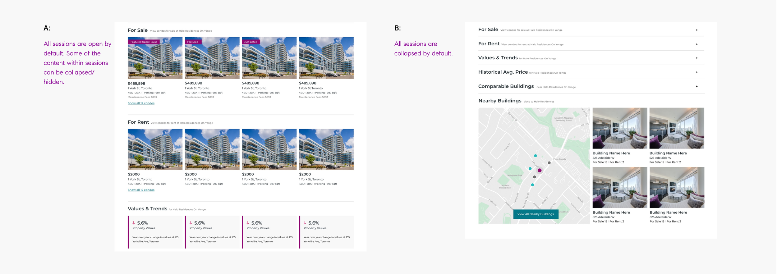
4. Determine the best solution by using A/B testing
To select the best solution possible, a A/B testing was performed with each of the design solution shown to around half of the website’s traffic over a one-month period of time. After analyzing the data, design A was chosen because it generated higher sign-up rate than B with statistical significance.
5. Fix inconsistent design issue by introducing a new Design System
We updated our design system as the old one was not clear, and out of date. There were multiple designers working on the pages on the website and we did not have a clear guide, which ended up resulting in different styles on different pages. I led the design system project, and we built a new design system which had a stronger style, worked better with our new branding and complied with WCAG 2.1 accessibility principles.

Outcome
This was a really exciting and fun project for me to work on as it provided real value, involved a ton of research, and detailed interaction work. I had learned many important takeaways from this project related to product and business processes at the same time.
Adapted to constantly changing requirements
New timelines, resourcing issues, and reprioritization meant the scope of the project was constantly changing. I had to adapt to those changes and still deliver the best design in time with tight deadlines.
Never overpromise and underdeliver
I learned how to define a true MVP vs. something that was simply not usable and therefore not shippable.
Communication was the key to success
Effective communication was the key to success to work in our product team. It helped me to have a full view of the product, and find the best design solution under our technical constraints.